23 Inspiring Canva Fonts That Go Together
Canva is an online graphic design tool everybody can use to create their publication. They provide tons of fonts and templates that are both beautiful and easy to use. Additionally, they’re constantly adding graphics, stickers, and fonts to their collection.
Font selection is essential for your final product. A good font can make or break the overall aesthetic of your design. That’s why it’s essential to know the Canva fonts that go together and how to use them best.
Want to learn more Canva tips and tricks? Check out these posts!
- 125 Best Canva Keywords for Elements
- How to Set Up Your Brand Kit in Canva Pro
- 37 Best Cursive and Calligraphy Fonts on Canva
Canva Fonts that Go Together
Here are Canva fonts to consider when designing your next piece of art:
1. Shrikhand + Tenor Sans
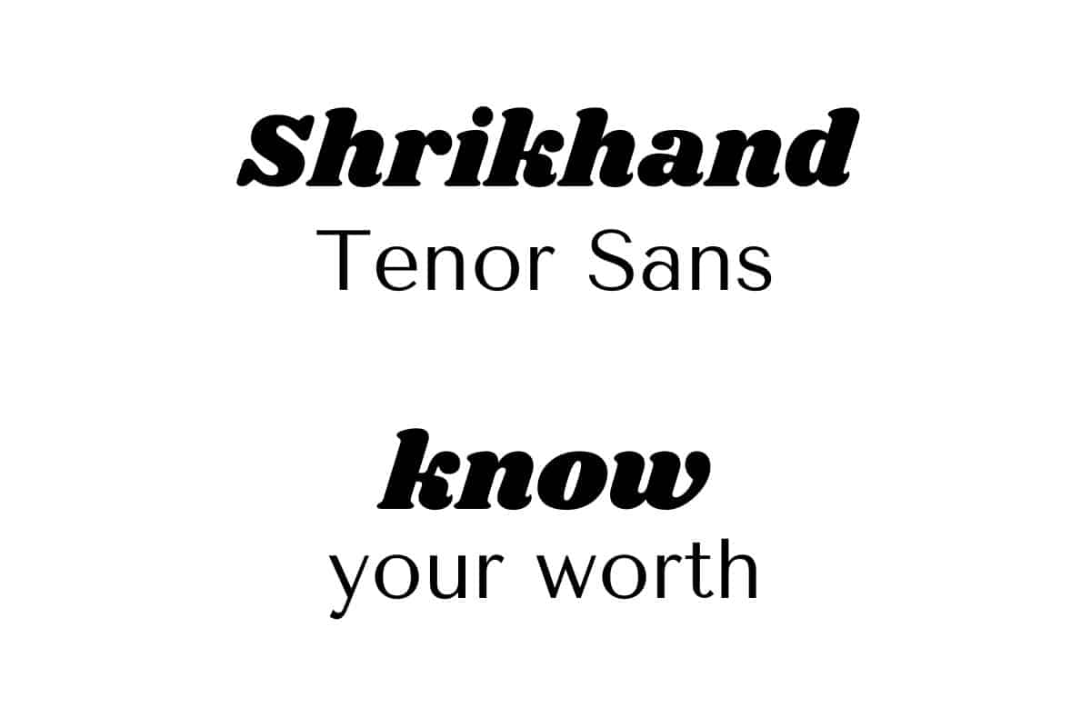
Shrikhand is a classy, decorative serif font that looks perfect as a header. It’s a bold font with a modern twist and has a strong, confident presence. It’s one of the most beautiful Canva fonts.
On the other hand, Tenor Sans is an extremely clean font specially designed for body text. Additionally, it looks good no matter how small its size is.
Combining these two fonts results in a simple and modern final product.
2. League Spartan + Libre Baskerville
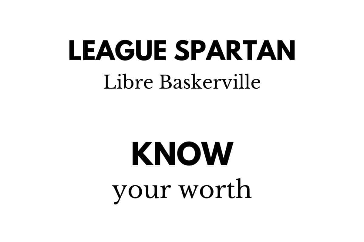
League Spartan is another modern font that has geometric solid straight lines. Contrarily, Libre Baskerville is a serif font that’s elegant and beautiful.
Although these two fonts aren’t alike, they pair pretty well, and their contrast perfectly reflects the overall result.
3. Lemonada Semi Bold + Open Sans Bold
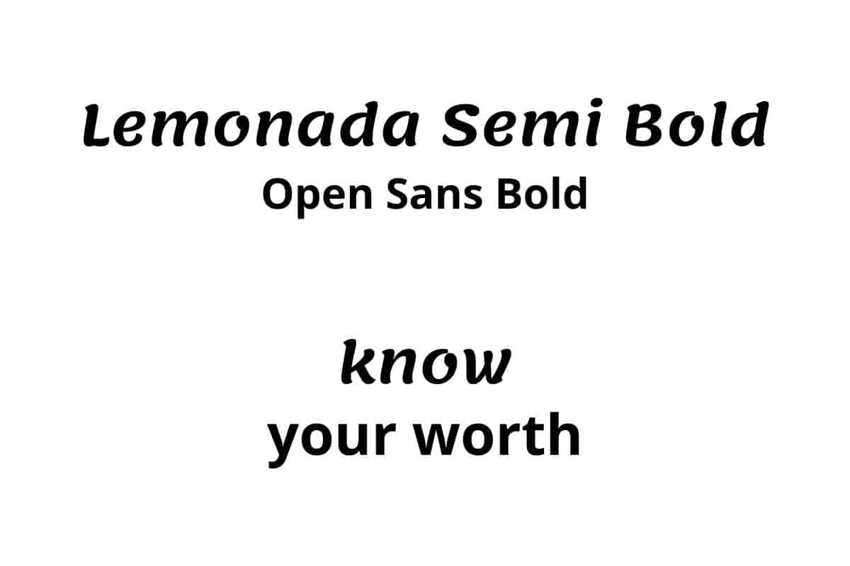
This combination is an excellent option for either presentations or social media posts.
The Lemonada Semi Bold font as a header adds this lively spirit to the design.
Open Sans Bold is another example of a classic, elegant sans-serif font, and it matches well as a body text with the Lemonada Semi Bold header.
4. Lovelo + Gistesy
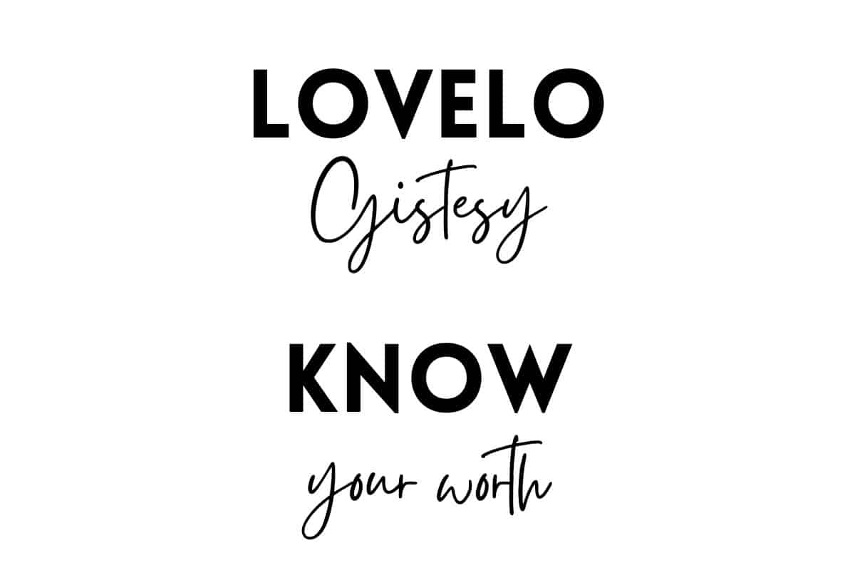
The sleek and clean form of the Lovelo font gives a contemporary sense to your writing.
Pair it with the playful, light Gistesy font, and you’ll have a match made in heaven. This combo is fantastic for lifestyle and fashion articles.
5. Lovelo + Montserrat

This is another possible Lovelo combo; however, this time, it’s with more of the same type of pairing.
Montserrat, like Lovelo, is a sans-serif typeface with clean lines and a geometric style.
Additionally, if you only have access to Canva’s free fonts, you can consider Montserrat as the best substitute for Proxima and Nova Gotham.
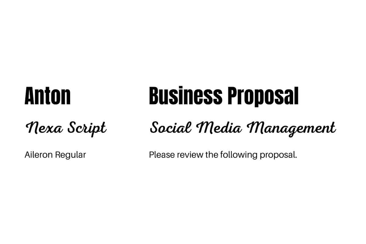
6. Anton + Nexa Script + Aileron Regular
Pairing two fonts isn’t a strict rule, as you can also mix and match three fonts in one piece of writing. That said, you should know that three fonts are the limit.
So, this mix is a great example of three fonts that go well together. These fonts are Anton as a header, Nexa Script as a subheader, and Aileron Regular as the main body text. The contrast between the three fonts creates an easy-on-the-eye harmony.
Anton is a straightforward traditional font that was used plentily in the advertisement industry. It’s also one of the best Canva fonts to use on Instagram.
In addition, Aileron Regular is an ideal body text font due to its clear and distinct lines. In opposition, Nexa Script balances everything out with its organic composition.
7. Julius Sans One + Archivo Narrow + Source Sans Pro.

Julius Sans One has elegant, simple, and slim letters that integrate adequately with the harsher look of Archivo Narrow.
This makes them great candidates for formal writing or resumes. Top them off with Source Sans Pro. and you’ll have an easy-to-read piece.
8. Chewy + League Spartan
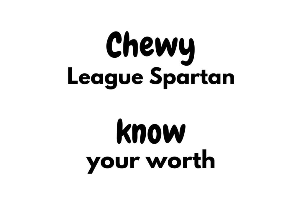
Getting back again to the playful and fun fonts with Chewy. It’s a chubby and playful font, which makes it perfect for informal articles.
Contrasting it with the modern League Spartan guarantees a striking and inventive result.
9. Chloe + Moontime

This combination has the same vibes as the Lovelo and Gistesy combination.
A modernized, classic serif font paired with an elegant and fun script font is everything you could think of when designing an invitation.
The result will be spectacular, whether it’s a wedding invitation or an event invitation.
10. High Cruiser + Fraunces Thin
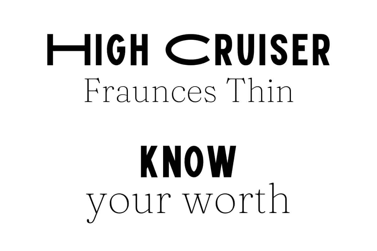
At first glance, High Cruiser may seem to you like an oddly shaped font with these elongated letters.
However, it gives a pretty in-your-face visual impact, which is great for grabbing the reader’s attention.
To level everything out, you need a basic font for the subheadings and body text, and what would match better than the soft-serif Fraunces Thin? This combination works best for editorial pieces.
11. Yellowtail + Open Sans Bold and Light
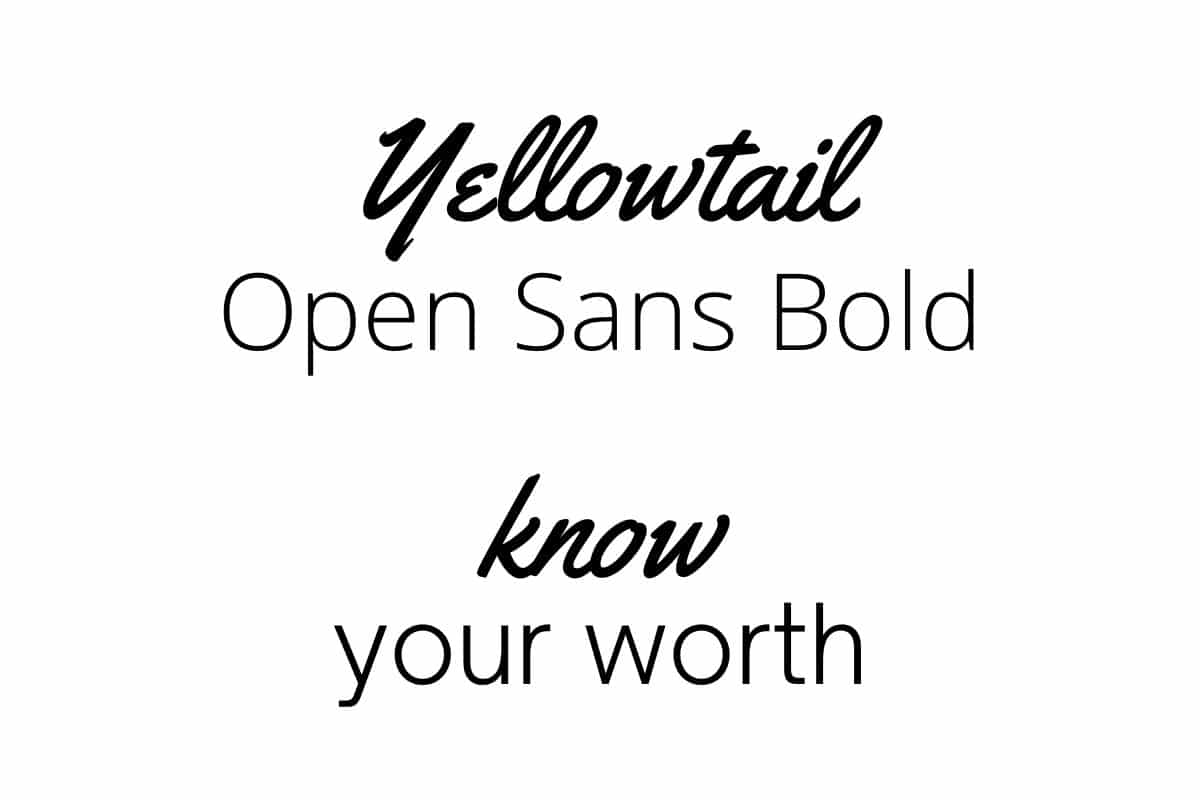
This is, without a doubt, one of the friskiest font combinations. The Yellowtail font has thick script letters contrasting pleasantly with the basic Open Sans.
Open Sans is the best option for complementing Yellowtail with its bold and light versions.
12. Bellaboo + Arimo + Space Mono
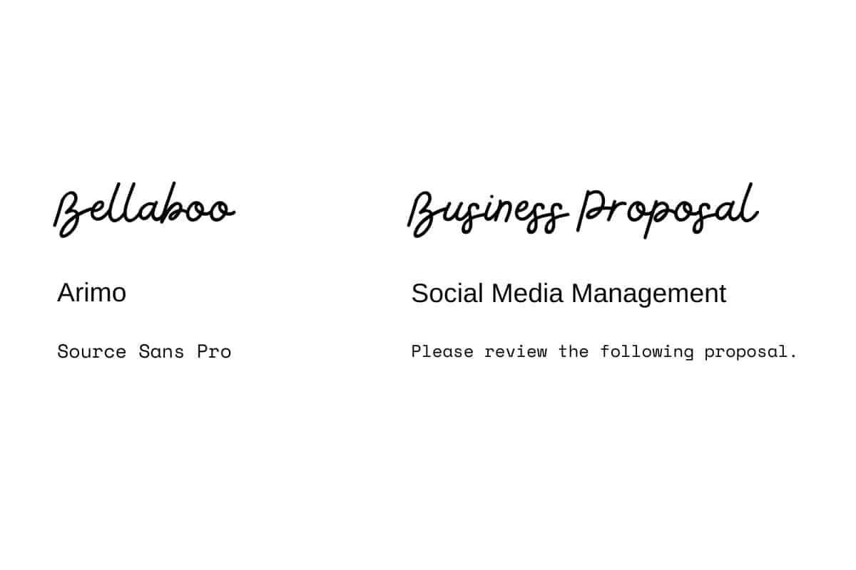
This trio combination has a feminine aura surrounding it. Bellaboo is elegant and sweet with swirly letters.
Arimo, on the other hand, is a more serious-looking font that balances the whole atmosphere. Then, finally, comes the Space Mono font for the additional retro touch.
13. Archivo Black + Archivo Narrow + Arialle
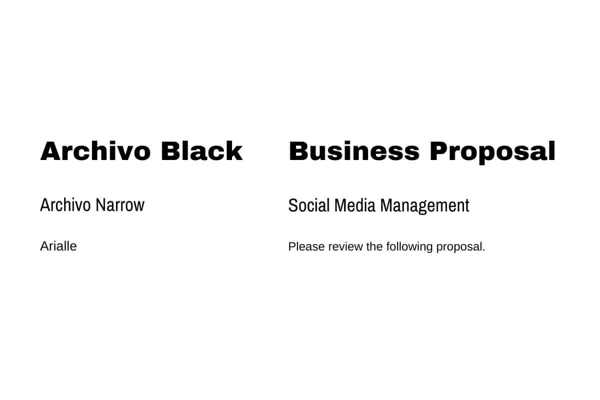
Combining a bold typeface with its lighter, the condensed version seems to be the right way to convey simplicity and cleanness.
With the Arialle, you graduate to an even more easy-to-read style, which is great for compelling reads.
14. Libre Baskerville
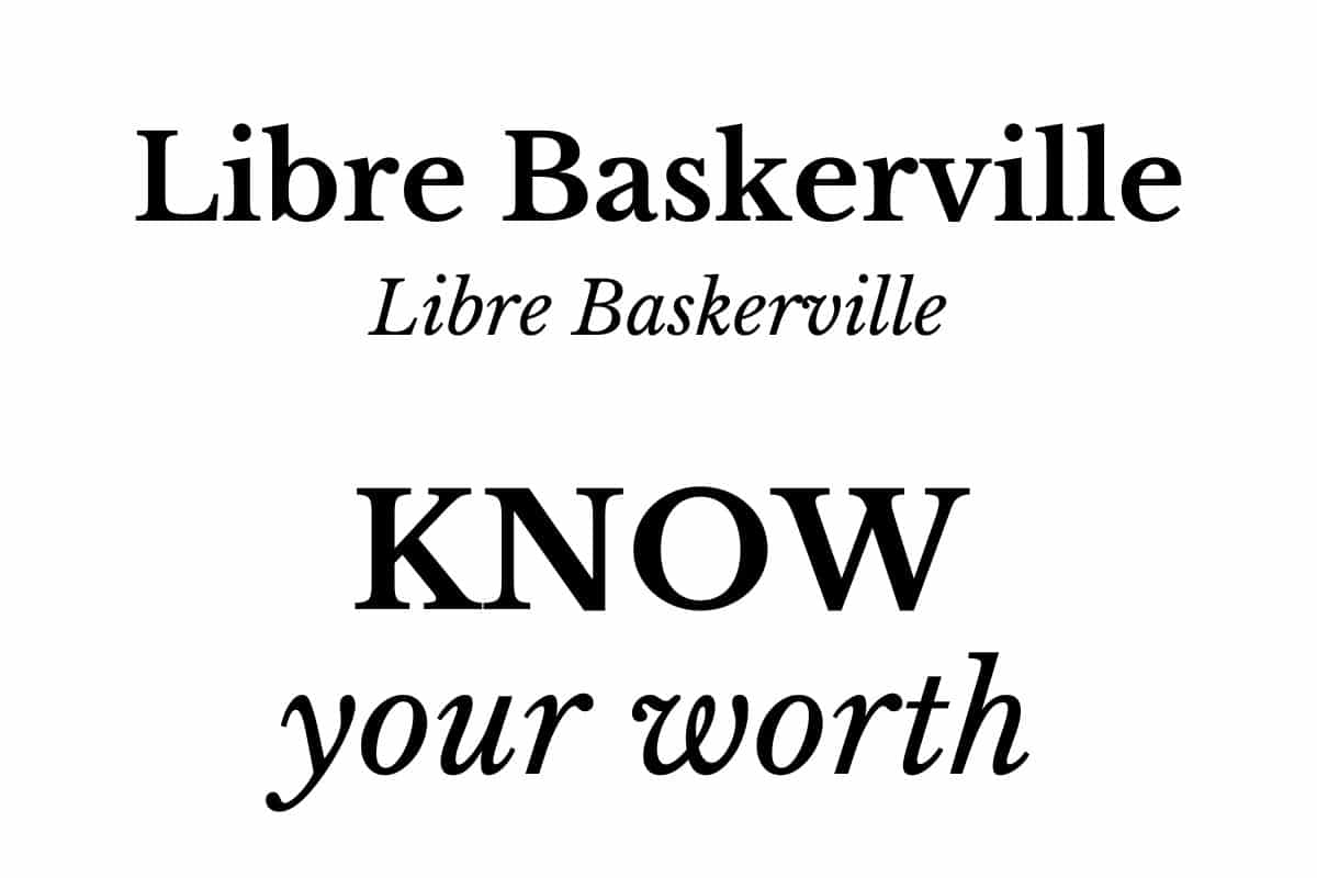
This is a bold choice to make, which is to stick to only one font as long as it has style variants. You may not believe that it works better than you think. Libre Baskerville is a classic serif that applies beautifully as a header and body text.
This style of using the same serif font all across your design fits completely with any e-book or something of that sort.
15. Versailles + Open Sans Light
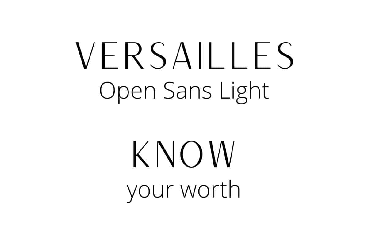
You’ll notice that Versailles is somehow similar to the font used by Versace but a bit slimmer.
It looks so elegant and luxurious. That’s why it goes well with Open Sans Light being a clean and simple font. This combo screams “Luxury Brand.”
16. Sacramento + Montserrat Light

Sacramento is yet another script font that gives you a “French Patisserie” mood.
It’s not that fit for too much writing; instead, it’s more of a heading font. That’s due to the connecting strokes that could make it hard to read if used as body text.
The tamed nature of Montserrat Light makes it the perfect font to balance everything out.
The Sacramento / Montserrat Light duo is flawless. It radiates femininity and elegance.
17. Six Caps + League Spartan
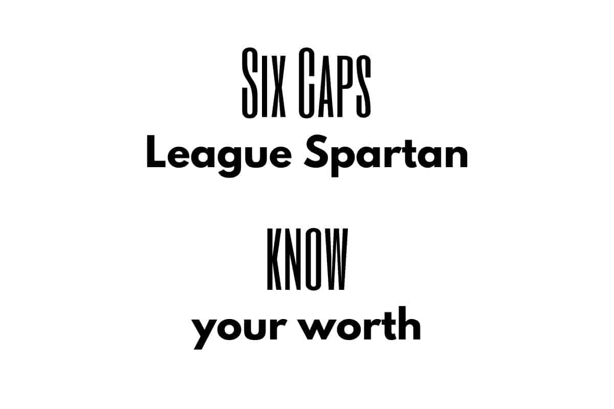
Six Caps is a statement display font that is really condensed and tight.
Merging it with the more classic League Spartan makes a bold yet lovely piece of design. The whole combination gives you a cinematic and retro feel.
18. Norwester + Kollektif Regular + Montserrat
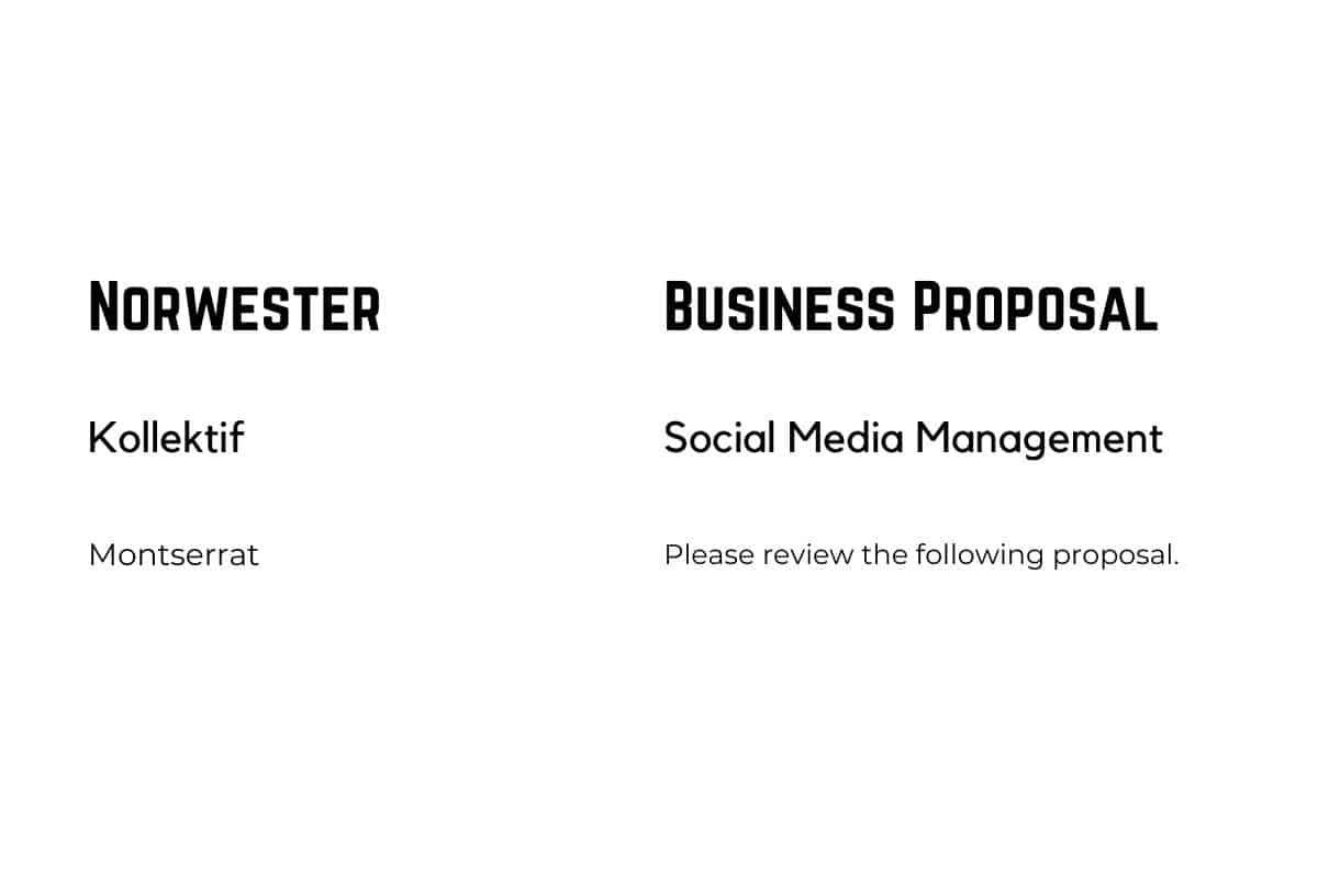
This is another winning combination. Norwester is a geometric font that looks really good in headers, as if it was specifically designed for that purpose.
When paired with the carefully structured Kollektif Regular and Montserrat, it’s a harmony of geometry.
This specific style creates a visual motif of strength and power which works best with industrial-themed designs.
19. Bodoni + Montserrat Light

Bodoni is a font that has this magazine heading style typeface.
It’s one of the most elegant and chic fonts out there. You can use its bold and light versions to create headings and subheadings.
Blending Bodoni with Montserrat adds that edgy and modern touch to your design.
This combination is great when creating a fashion magazine or fashion catalog cover.
20. Playlist Script + Hussar Ekologicsy

Playlist Script is a hand-written script font that looks fancy and easy on the eye.
Combining it with the hollow Hussar Ekologicsky is an excellent choice.
You might get taken aback by the idea, but believe me, you won’t regret using this combo.
21. Brilliant Signature + Aileron Thin

As its name suggests, Brilliant Signature is a script, hand-written font that looks like a signature. It’s airy and classy, which makes it perfect for high-end brand designs.
Additionally, Aileron Thin has the same elegance and airiness but with a minimal typeface that’s more straightforward.
The two fonts together are another match made in heaven.
22. Sifonn + Bebas Neue + Montserrat Light

Three geometric typefaces might seem like something a bit far-fetched. However, thinking about it, it has this art-deco and contemporary feel.
Sifonn is ideal for headings because it’s a display font with powerful vibes. The interference of Bebas Neue for subheadings creates a harmonized look.
Of course, we can’t forget about Montserrat Light; that’s one of the best body text fonts on Canva. It’s simple, light, and visually appealing.
23. Termus Light + Trirong Light
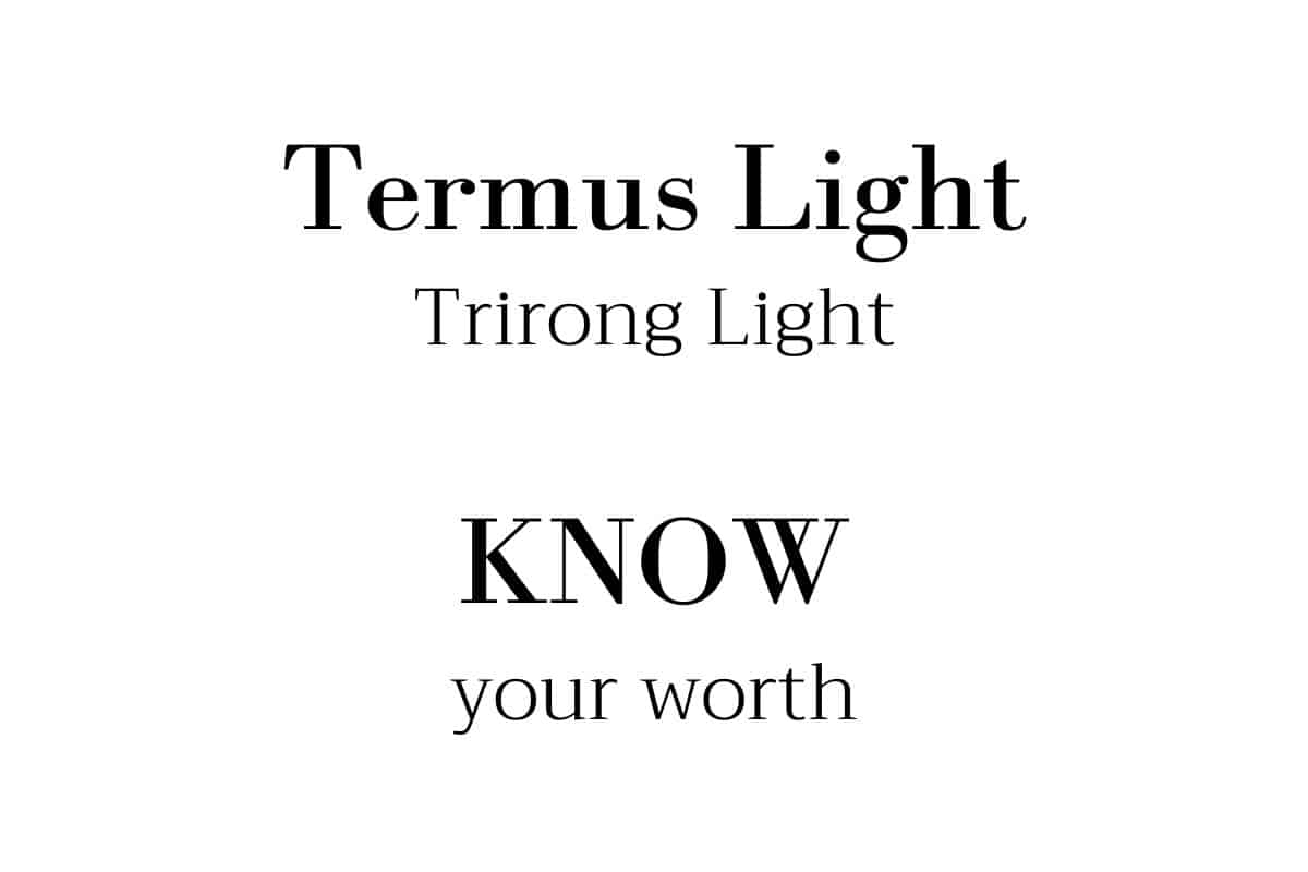
Termus Light and Trirong Light make an elegant combination. They are both serif fonts that compliment each other well.
Bottom Line
Canva is a brilliant tool that helps a lot in the design process. The pro version offers even more font diversity to take your work to the next level. However, free fonts are almost as creative and artistic as paid ones.
Now that you know how Canva fonts that go together can drastically change the result of your design power, you should never underestimate the power of font pairing. That’s because a successful font pairing highly contributes to the amazing results you’re after.